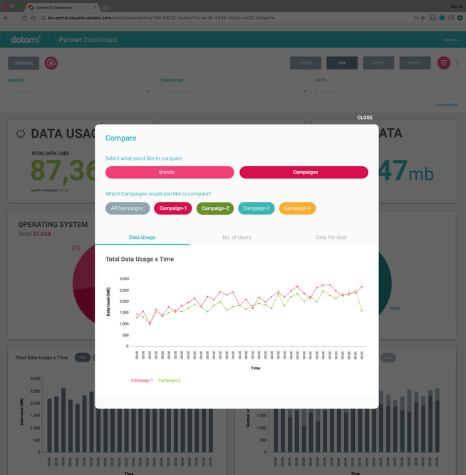
Campaign Manager 005
![]()
![001]()
![002]()
![003.1]()
![003]()
![004]()
![004.1]()
![006]()
![007]()
![008]()


The Approach
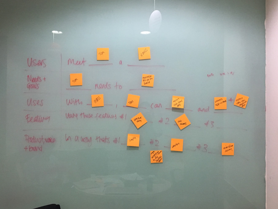
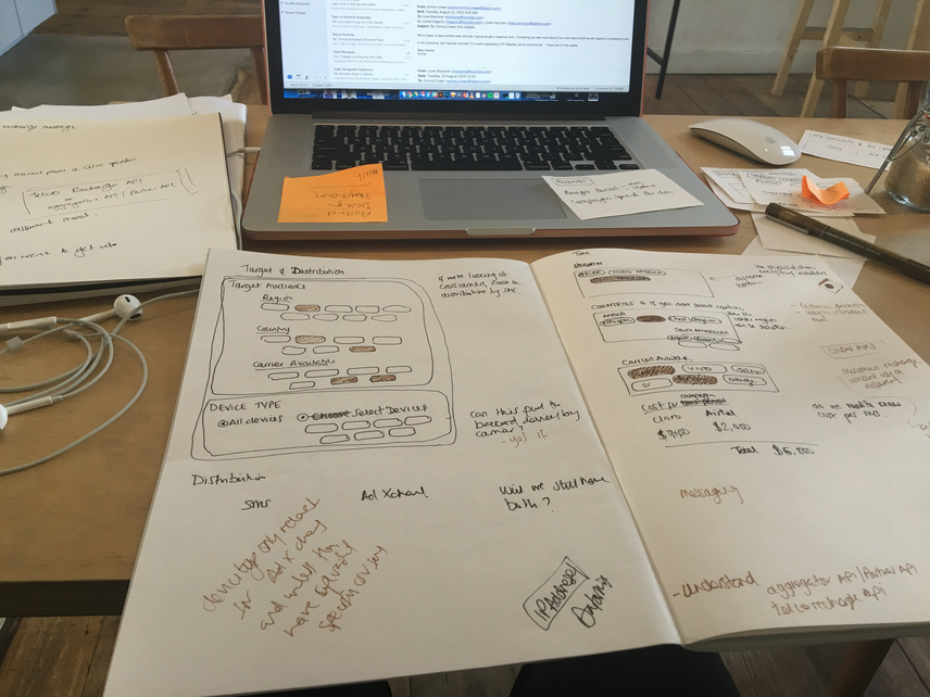
001 I facilitated a discovery workshop in our India office. User story mapping, building epics with the engineering team
002 My favourite tool to find an overarching problem statement, courtesy of Kate Rutter. There’s a great video of her at UXLX2015 talking through this.
003 Making sense: synthesis. After our group-wide user-story mapping, I refined it.
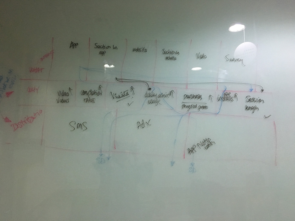
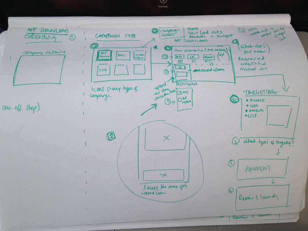
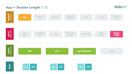
004 Understanding how to build an interface for combination campaigns, the most complex part of the process was campaign set up (part 2). How could I design an interface that allowed for an elementary campaign set-up, that demonstrates the multi-faceted approach to campaign management.
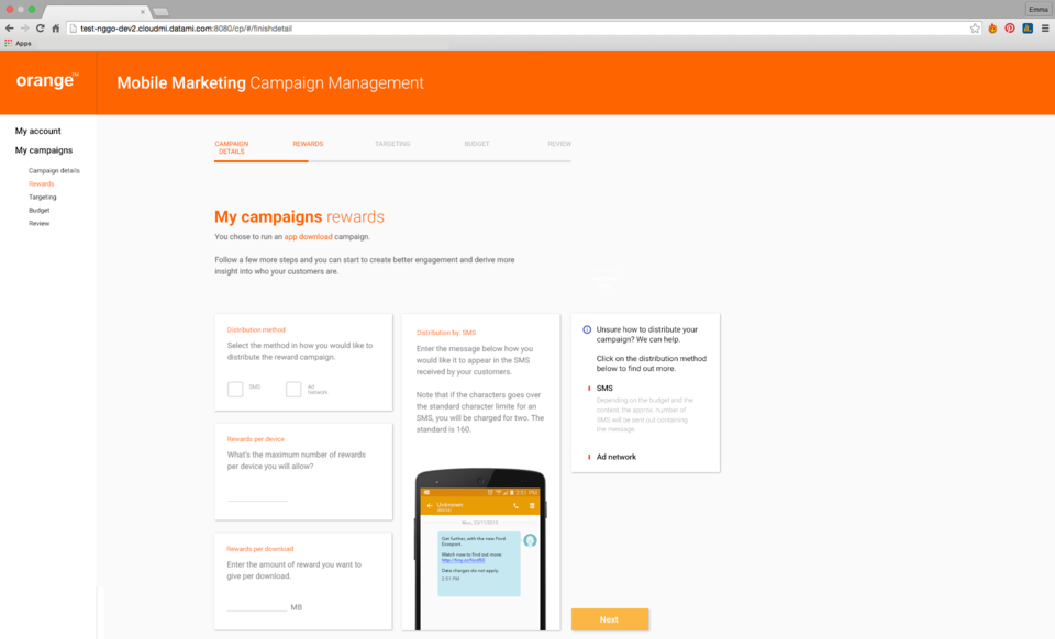
005 Final design.
006 Alternative design.
007 Alternative design.
008 Alternative design.
My Role
Facilitated workshop: Research, IA, concept, design, interaction, user experience
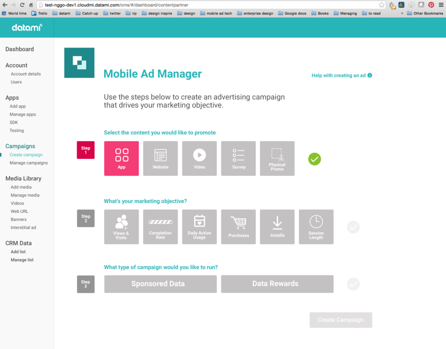
The Campaign Ad Manager was the main feature of Datami’s product suite and part 1 of 2 projects in this portfolio. A version of the interface was in place before I arrived at Datami, however, it needed a redesign to make it usable for anyone to create a campaign as opposed to purely functional for a development team in test mode.
To build out the experience, simplify existing functions and add in new features, I had to grasp what the business/user objectives were and fully understand each step of the campaign build process. This involved re-organised some of the current features under different steps (the flow of creating a campaign felt natural) and adding new ones.
I added a conversational dialogue with tooltips and labeling. As each step was approached, help information to guide the user was in visible sight should they get stuck.
The journey and interaction at each step under each stage was my main focus.
001 I facilitated a discovery workshop in our India office. User story mapping, building epics with the engineering team
002 My favourite tool to find an overarching problem statement, courtesy of Kate Rutter. There’s a great video of her at UXLX2015 talking through this.
003 Making sense: synthesis. After our group-wide user-story mapping, I refined it.
004 Understanding how to build an interface for combination campaigns, the most complex part of the process was campaign set up (part 2). How could I design an interface that allowed for an elementary campaign set-up, that demonstrates the multi-faceted approach to campaign management.
005 Final design.
006 Alternative design.
007 Alternative design.
008 Alternative design.
My Role
Facilitated workshop: Research, IA, concept, design, interaction, user experience
The Campaign Ad Manager was the main feature of Datami’s product suite and part 1 of 2 projects in this portfolio. A version of the interface was in place before I arrived at Datami, however, it needed a redesign to make it usable for anyone to create a campaign as opposed to purely functional for a development team in test mode.
To build out the experience, simplify existing functions and add in new features, I had to grasp what the business/user objectives were and fully understand each step of the campaign build process. This involved re-organised some of the current features under different steps (the flow of creating a campaign felt natural) and adding new ones.
I added a conversational dialogue with tooltips and labeling. As each step was approached, help information to guide the user was in visible sight should they get stuck.
The journey and interaction at each step under each stage was my main focus.
Project (1)
* Campaign Manager
(Part 1/2)
A B2B2C platform designed to allow Datami customers to manage mobile advertisement using sponsored data.
Real-world Challenge
In countries like Mexico, Brazil, India, Philippines and Africa, the cost of mobile data is expensive. Mobile users pay by the gig and often use apps that offer services to watch ads in exchange for earning small change or small amounts of data. For these consumers, watching videos while roaming is out of the question.
Why It Exists
In order for brands to connect to consumers while on the go, Datami became the middle-man, offering integrations between telecommunication companies and brands. To provide an easy application for consumer brands to connect with their customers, by paying for their data usage in exchange for engaging with their brand in some form (watching an ad, sharing something on Facebook).
Was it a success?
As a credible alternative to Facebook, I was happy to learn after the build that Facebook’s Ad Manager has a similar approach to building ads. While I don’t advocate for simply doing something that another company does well, it was validating in the sense that it had simplified a complex business function.
We continued to work closely with certain partners to help refine each step, which involved remotely observing users and task-associated analyses. And, as we learned more about the sponsored data, the requirements changed as we learned more about which functions were more important to our users, so the interface changed. I reworked the layout building on Google’s Material Design library as a foundation.
The Campaign Ad Manager Platform is the main feature of Datami’s product suite. A version of the interface was in place before I arrived at Datami but it needed a rebuild to make it more user friendly and intuitive. To build out the experience, simplify existing functions and add in new features, I learned what each step did and re-organised some of those features under different stages so that the flow of creating a campaign felt more natural.
I added a conversational dialogue in the help hovers and labels, so as each step was approached, there was help information to guide the user should they get stuck. The journey and interaction at each step under each stage was my main focus.
Campaign Builder 002.1
![]()
![001]()
![001.1]()
![001.2]()
![002]()
![002.2]()
![002.3]()


The Approach
001 Understand the combination of campaigns that could occur. Working with the product manager for the platform, we mapped out the variants. This image depicts the options for just "App" type of campaigns, there were 16 altogether.
002 In the Campaign Builder, partners need to select a property/content to promote (Step 1), then decide on a marketing objective (Step 2) and on the type of campaign; Sponsored and/or Data Rewards (Step 3). Sponsored Data and Data Rewards are the core technology to Datami's flagship products; all of our products are geared towards allowing our partners to run campaigns using this technology. To run a marketing campaign that offers sponsored data and data rewards.
My Role
Facilitated workshop: Research, IA, concept, design, interaction, user experience:
Because I was the lead on the platform (project 1), I knew intricately how we had user-storied features and the functionality we were looking to build. This is an extension from project 1.
Project (01.1)
* Campaign Builder
(Part 2/2)
A closer look at the Campaign Builder step of the Campaign Ad Manager Platform (as seen in Part 1). This showcase focuses on the campaign creation component of the platform.
Real-world Challenge
To simplify a complex campaign set up process.
Sponsored data was a new concept and the users given the task were not familiar to the concept or process. The goal was to guide people through a campaign set-up, breaking down each step into an easy to understand component.
Why It Exists
Depending on which components are selected here, the steps further down the line configures for the appropriate information. This ensured a seamless experience while showing only the relevant fields for the campaign, as opposed to disabling sections.
Was it a success?
In a similar sense to the part 1 of this project (Campaign Manager platform), it helped the users know how to set up a campaign and the type of campaign they were building. In theory it worked, for delivery however, each build was scoped too big and the team struggled to deliver. My lesson here is to be very clear about what we’re trying to build and the expectation of functionality.
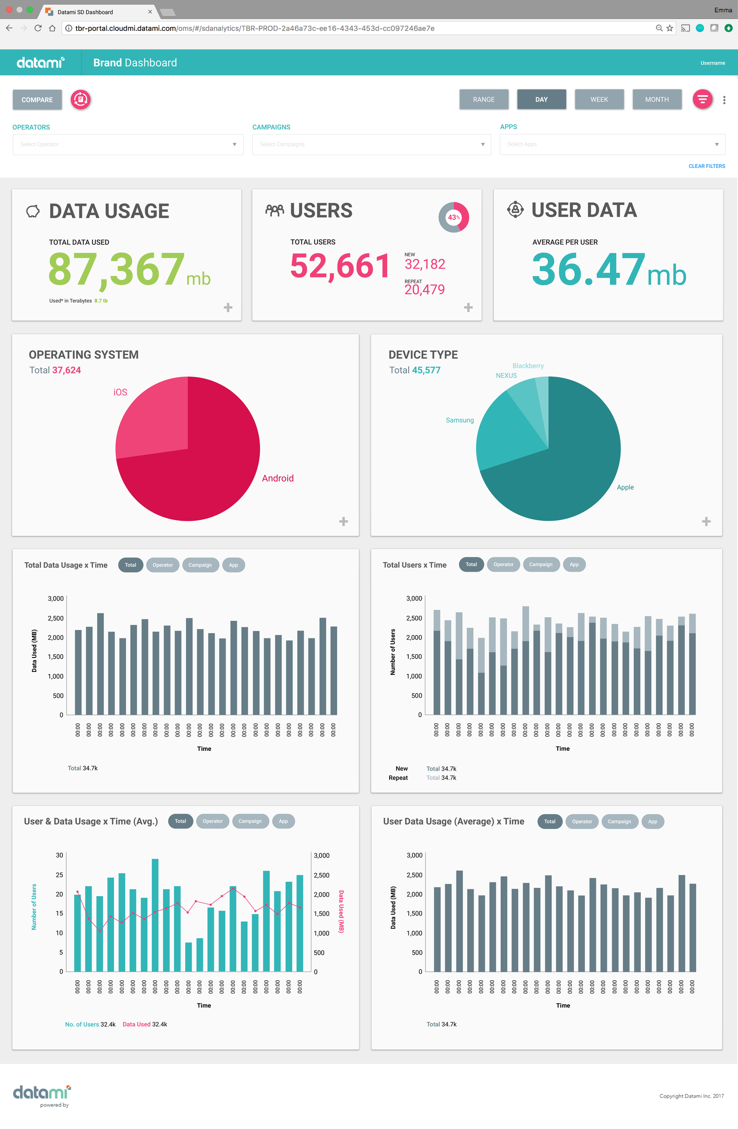
Analytics Dashboard 002
![]()
![001]()
![001.1]()
![003]()
![003.1]()
![004]()
![005]()
![006]()
![007]()


The Approach
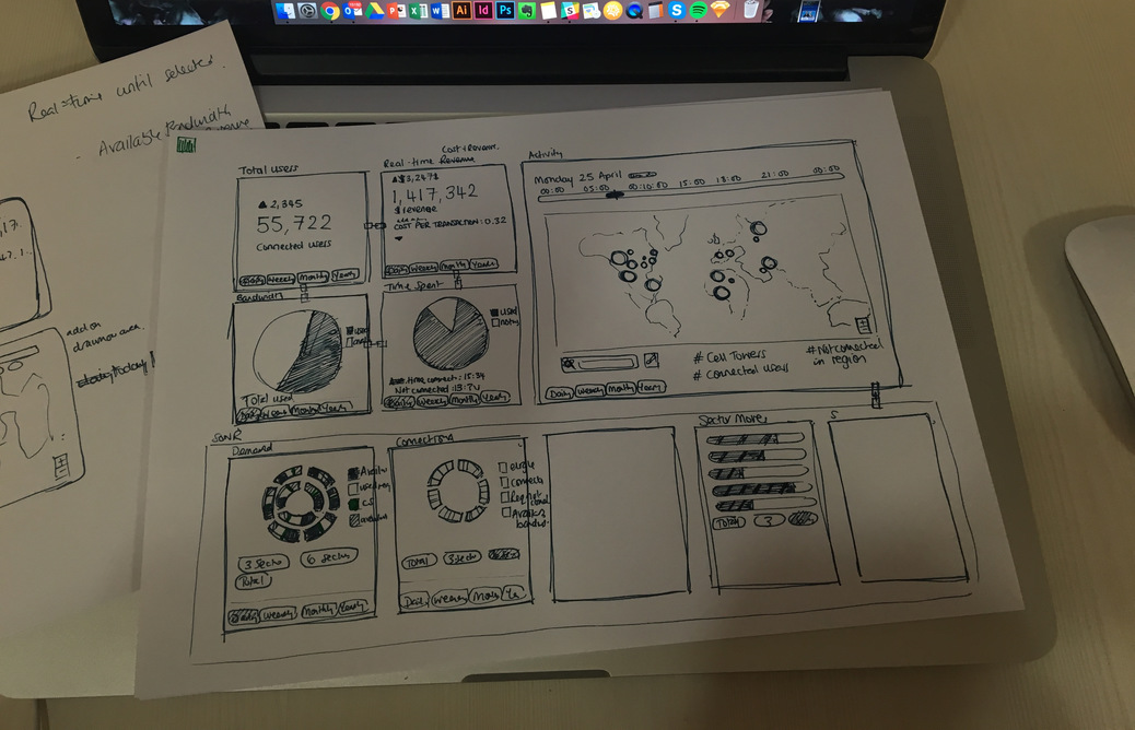
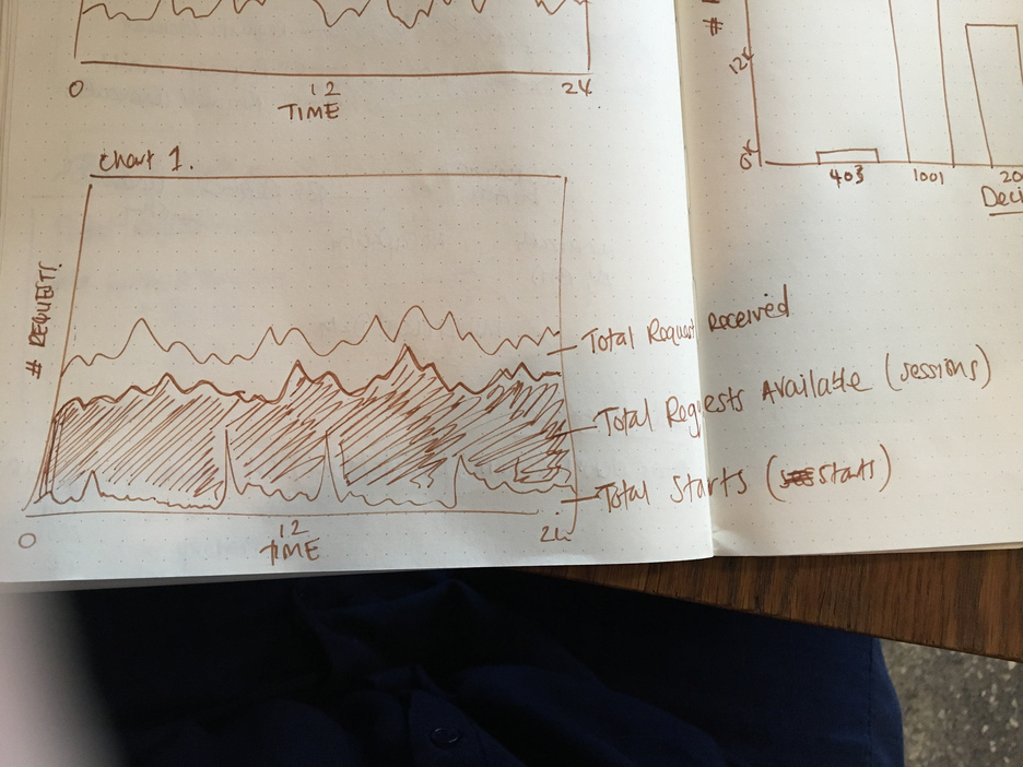
001 Thumbnails and sketching for data layout.
002 First product release.
003 Additional features (data point drill-down).
004 Iteration 1.
005 Iteration 2.
006 Iteration 3.
007 Future release.
My Role
Research into marketing and advertising metrics, customer feedback on important data, design, IX
Working with the sales team, we learned from customers what the most important metrics were and designed a dashboard that was a visual representation of the data collected. Ad campaign metrics are not new, so we looked to blend the data terminology that was useful to them already, like user types, sessions, unique views etc. (Google was a great reference for this), and layer in the new data.
Project (2)
*Analytics Dashboard
Analytics dashboard for Datami’s suite of products.
Real-world Challenge
To help clients deliver successful campaigns and prove value, we needed to provide a method of reporting. Initially, these reports were ran on a script and sent over in an excel form, but we knew there was more value in being able to send them login information with real-time data. This ultimately helped them decide which campaigns to keep running and how to tweak for more successful results.
Why It Exists
Datami's suite of products allow partners to run marketing campaigns based on Sponsored Data and Data Reward technology. In order for partners to know how effective the campaign is, an analytics dashboard was developed to show performance metrics.
Was it a success?
The customers loved this! We did have a challenge in that all the metrics we wanted to show weren’t ready in the first release, so pushed new data over a period of time.
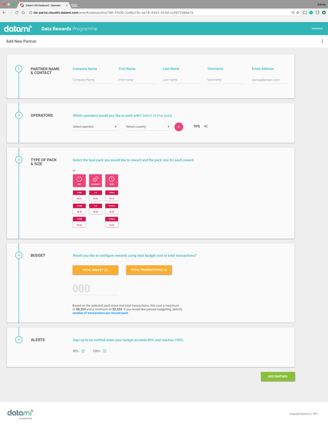
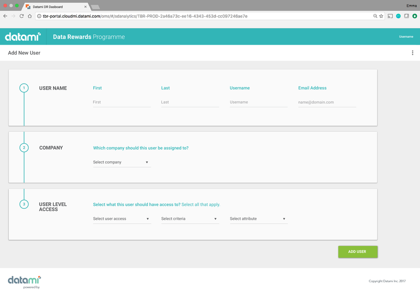
Data Rewards 001
![]()
![001.1]()
![002]()
![002.1]()


The Approach
001 Final product: add a new partner and user
002 Final product: partner and user management
My Role
Research, IA, concept, IX, UX, visual design.
001 Final product: add a new partner and user
002 Final product: partner and user management
My Role
Research, IA, concept, IX, UX, visual design.
Project (3)
* Data Rewards Platform
A core product of Datami's suite, the rewards platform onboards Partners into the ecosystem to run reward campaigns.
Real-world Challenge
Datami needed a solution to bringing new partners onboard its platform. Before this existed, to get partner into the Datami platform it was a very manual process; with a sales person working through a list of questions with the main point of contact for any given customer and then someone from the development team to input this data into the backend. Not only was this not scalable, but there was room for error. The Data Rewards platform was a way for Datami’s products to be found in the public domain and for customers to quickly get started using Data Reward technology.
Why It Exists
A very quick turnaround project and working directly with the CEO for the requirements, this product came about after he was speaking with various customers about why they couldn’t get onto the system themselves. And so, we made it. We whiteboarded his thoughts and ideas and I went on to design these screens in addition to what I knew about the product at the time. It needed to be a simple, one-screen onboarding point.
Was it a success?
In idea and execution, yes. As a business we didn’t promote it and it ended up not being used for its intent purpose. The sales team used this in direct conversation with a customer, so it wasn’t entirely autonomous. We could have found more ways to promote this externally or perhaps better validated the feasibility in the beginning.
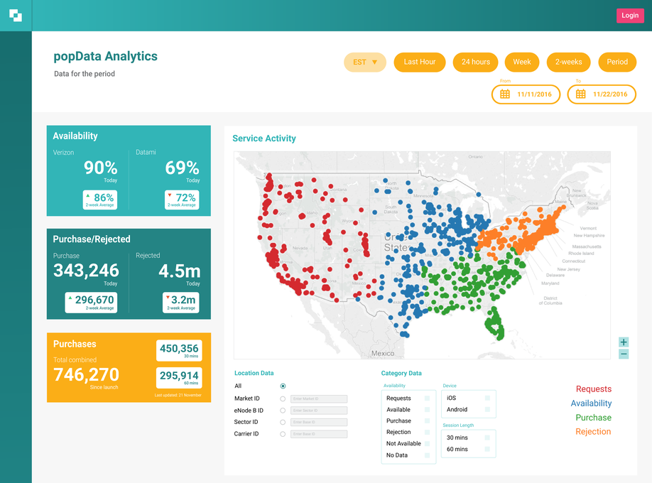
Peak Valley Dashboard 002
![]()
![001]()
![001.1]()
![001.3]()
![001.2]()
![002.1]()


The Approach
001 Research and thumbnailing data charts.
002 MVP. This is the design that went into production. Additional features were added to this that are not reflected in these pictures. Each section has functionality that can be modified to view different information. The map, for example, can be modified to show just iOS users, or people that have purchased the service AND on iOS.
My Role
Research, design, IX, UX, visual design.
I sought out technical knowledge on the technology from the CTO and engineering team that had been working on the tech. It was important to build a dashboard for senior management within the network operator, to see what’s happening on their network, how much it’s costing them vs profit, and visually where it’s most popular. I looked at the data the backend was collecting and the information management needed to make decisions on. I thought about the levels of management, who would need to view this, and the best way to represent the data points.
In addition, I researched how cell towers work, data visualisations, how network data is collected, chart types and overall dashboard usability. As of January 2018, this was used by a large, US network operator and in talks with a European network operator.
Project (4)
* Peak Valley Dashboard
Analytics dashboard for Peak Valley Technology.
Real-world Challenge
As a mobile operator (telecommunications providers), their network has times when its at full capacity and it has times when it’s underused. What if there was a way for operators to offer unlimited data at a reduced cost for time-allocated slots. It allowed operators to capitalize on unused network capacity, and mobile consumers to enjoy a better experience.
Why It Exists
Peak Valley technology is the premise in which Datami is built on. An algorithm that allows network operators to detect highs and lows (where the peak valley comes from) in network congestion, and offers its subscribers time/location based data. Detecting network congestion at cell tower level, if a cell tower is empty, network operators can offer data at reduced cost, dependant on peak and off-peak times.
Was it a success?
Once this dashboard went live, it provided instant value to Datami and the network operator. It was an easy way for the network to make money and not do anything. We continued to build out features.
